Friday 8 April 2011

Done!

After enough blog posts, enough development, I am finally finished. Evaluation time.

If i was given the chance to do D&AD again, I would have gone down the different route of illustration and done the diesel brief. Reason why I didnt take this path is that from class discussion, we though they wanted more than just an image, although from viewing classmates work, it seemed that is what could be done. Also I think the illustration would have had more chance to show creativity and would have been more exciting and enjoyable to do.
Problems with this brief is my idea's came too late, thus development was rushed.
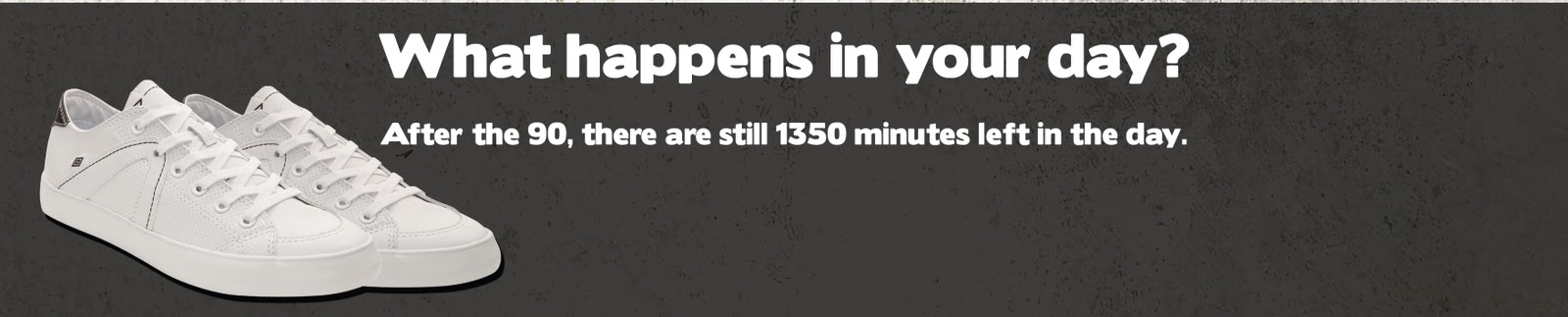
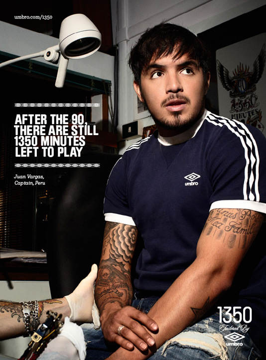
Aspects I am pleased with are how many finals I did, I think they look good as a set, and could work well as a campaign. Also there is easily room for more themes to base around the shoe.
Aspects that arent so strong I think is the aestheticall look of the posters, not entirely pleasing toward the eyes, and if given more time on the brief I would have solved this with more attention towards the designs.
And for my final blog post I shall leave you with my three final pieces. Enjoy.


Decision.

Decision on my previous post is to choose the bottom caption line "its all in the footwork" because of how it relates to the game, but not too much that it gets confused with a football shoe.
Also think I will be using both the image of the trainers and the logo.
Aswell as this, the brief requires that the logo is to be featured.

Small Changes.


As I am coming toward deadline now, its just a case of making final touches. Today's issue is the bottom tag line, how it looks what it says etc.

Here Im undecided between, position of logo or whether it needs a logo. Position of shoes or if the image is needed. And caption lines. Well the pictures do the talking.

Thursday 7 April 2011

Another poster theme.

Thought I would make more of a set, and choose another theme. After discussion with my teacher we thought it best to go for work theme. Basic typical office worker, taking calls, making emails, meeting clients. And to have words based around the work theme.
What im going to do next, is play around with type in the black box, figure out what im going to put, wether to swap the shoes for a logo, have both, fonts, colours etc.
But for now ill leave you with the work theme poster.

Friday 1 April 2011

Night Version

Just updated the night version to follow the theme of the day one. Updated with different words, colours, background. Also changed the original caption at the botom, but only by replacing one word. Still makes a different to me.

Im getting there.

Just had another chat with my tutor, deciding to go with another tag line, which enforces the idea on of what the advert idea. Also discussed on having more towards the background to add to the theme of what the type is talking about. So a cracked floor for the day theme (which I have applied to the above), dancefloor for the night scene, and I will be doing another edition based around working. So will have words like, business, powerpoint, presentation.
New and improved version is above, still more work to be done.

Below are the "blueprints" for what I have to do.

Wednesday 30 March 2011

Its difficult.

Been attempting to do my old idea, but this time on the actually shoe sole it should be on, and it doesnt seem to be going to plan, I think this is because theres much more type to it compared to the other one. So back into photoshop, to give it another go with less type and maybe a different font, Although I have to say the other shoe was much easier to do because the sole was much more chunky and easier to work around.
Heres where I am up to now.

Tuesday 29 March 2011

Latest Idea.

My latest sketched idea, that i was developing. Well, thats hit a brick wall. After discussion with my tutor, that design will go no further. Instead I will be developing onwards the shoe print idea, but with slight adjustment. Adjustments being, change of tag line, that brings the idea in from a different angle, and to also trace the words around the actually shoe, because the foot print i traced wasnt based on the actually shoe, so I have a lot of work to do then.

Above is an image of how far the sketch went. Just to show how far I got with it. It would have been good to have gone further with this and to advance my illustrative skills.

Monday 28 March 2011

Yet another one of my idea's updated.


Yes, im that bad with deciding which to run with, I gave another past idea a update, although compared to the other idea's I dont think its as strong. I dont think its strong enough to run with as an idea. I only find it aesthetically pleasing, but it doesnt really answer the brief so think ill be moving swiftly onwards from this idea and returning back to my other idea's. Anyway, here it is.


This turned more into a technical exercise from folloing tutorials and twisting them to suit. But this design I think has hit a brick wall and will go no further.

Second idea different theme.


Still playing with the below ideas, I went for another approach, as though it was part of a set campaign with different themes. So the first ones below just related to day to day activity, I then though of other situations that are casual to promote the type of shoe it is but different theme/ genre of activity. This (obviously fro looking below) is that of a night out down town. Words relating to what typical happens on a night out. The result is below. Although I chose run with a different font, which could have been a mistake as it might have been better to have gone with the same one used on previous ones. Then again its a different theme and this type suited this theme more than the other fonts.


Also tried another colour just for trial and errors sake. Still yet to decide and like the post below these designs are yet to be finished and generally tweaked.

Old Ideas.

Aswell as playing with my new idea (post below) Iv also been messing with my previous designs, because im finding it hard to choose which to run with for my final piece.
So I went back to the footprint idea, didnt try with anymore font because of how time consuming it was, so decided to try finishing touches on it, background, text etc. It still looks unfinished but unsure what to do next with it.


From various amounts of feedback, people are saying to run with the middle design, as the font in footprint works better, although im swaying more toward the top one. Still I have more trial and error to go so this design will be updated.


This was another attempt, only differences are background, logo, and text under it is the same as the font foot print, so in my opinion works better. But as said, still a long way to go.

Sunday 27 March 2011

Sketch Update

Well as I said in the previous post, that I would update on the sketch. And I have, I got rid of the "live" down the side" and after looking at it some more, I decided I dont like the "Lifestyle" underneath, So im going to change the look of that word. But keep the word.
Also Ill be adding some more general random characters.
All this is for a general urban look, give it the street graffiti urban style, which is far enough away from the football style they usually have.

How boredem drove me to this.

Iv gone through so many different idea's with this umbro brief, and to the point where its winding me up to even glance at this brief. So instead I just started to doodle and draw around the shoe, with the previous idea and taking inspiration from the other images I found of someone elses designs below.

This is only a pen drawing, and Iv scanned it in to do some more editing to it, as I want to get rid of the "live" word, because it looks to out of place, and this time draw it in the same font style as the word "casual".

Problems with this design is I dont think it really answers the brief, although to me it is more aesthetically pleasing. I am going to try and adapt something towards the design so that it answers the brief, maybe just with a slogan or something else.
Design is below. I will post any updated drawing I do on it, once Iv cut the end word out and drawn on it again.

Sunday 20 March 2011

Another font.

Just tried my design idea out with a different font, seems to work just aswell as the other, this one I think has more street-cred. More of an urban theme, which I think works just aswell if not better. Any ideas on which way to go drop a comment, as Im useless with choice.

Yet More ideas.

After the previous post, were I had another idea on what to do, I went into photoshop, but started playing with the first two designs I did, and started to develop more ideas towards those.
First I started playing with my first footstep idea. Reason why I didnt carry it on from the first design is the typeface was ugly, but I gave it another go with another font, and It seems to work okay. Nothing amazing but its all about trial and error.
A stronger font, more blocky does work better, although im tempted to try it again with another font.

Aswell as changing the foot print design, I had a small tweak with the other field design, although I feel like iv hit a brick wall with that design aswell.
I was going to have a big festival in the background or some sort of fun fair but it seemed to clash with the design and wasnt working out well, so for now im going to just leave it with the type on it, and play with the type in future.


Saturday 19 March 2011

Having a gander.

Just been flicking through the internet at random designs and seen the above which I thought was pretty cool. Not really gonna get me anywhere but thought it was aesthetically pleasing and that I would share it with you the viewer.

Also had another idea, although because its evolved from something else iv seen on the internet then it may just come under plagiarism, because its the same basic concept/ idea. Pictures below will help aid my explanation, so here goes.


After seeing the visuals below, I would take the idea of a world evolving out of the shoe. But the elements bursting out of the shoe would be to do with daily casual life, things you would do in your 1350 minutes off the pitch. These could be illustrated things or typographic with funky colourfull looking words bursting out the shoe.
Although I will have to discuss this with the teachers to see if I would be able to do it, or if it wil fall under copying others work.


Thursday 17 March 2011

Just been flicking through "sport magazine" and came across umbro's 1350 clothing range. The clothing was apparently inspired by the 1978 world cup.
Personal opinions on the clothing range are it does have a massive influence of their past products, and is said to have elements and inspiration from the 1978 world cup.
In my opinion, the trainers we are designing for dont seem to reflect this clothing range, the trainers I think need more on them, maybe the diamond icon strips alike that from the clothing.

I also found a quote from a sport blog about the the 1350 range.

"
Diamond Icons takes inspiration from the Umbro archives and references authentic Umbro brand heritage with the rebirth of the vintage running diamond tape.
An icon of the 1970s, the Umbro diamond taping was created with a distinct personality and substance, epitomising the look and feel of an era. It reached its zenith in Argentina at the 1978 World Cup and will forever be held in football folklore."

Monday 14 March 2011

Second idea


After disliking my first idea, I went back to doodling and then photoshop and came out with the above image. This is far from finished, but the idea is to have scene on the hills of everything going on, some sort of fun fair or music festival. To show other things to do that aren't based on the pitch. Im
pleased with the typography on this, and how it looks, main issue is the font though, because I think the "f" can be mistaken for a "t" so it may be yet to be changed.

Monday 7 March 2011

Idea

One idea iv had is to do with shoe prints. Like what you would see in sand, sand, mud or snow. The idea is that the foot print has aspects of casual life. What people tend to do (away from the pitch). With catchy words or just words describing things we casually do. Shop, eat etc. In each footprint is what someone has done in the day (not on the pitch).

I gave this idea a go in photoshop but I think it wont be going any further as I dont exactly see it as aesthetically pleasing, or where else I could go with it. Really just hit a brick wall with this idea. But thought it was worth showing for developments sake.


The actual umbro design


After flicking through a free magazine (sport) I saw the advertisement for the umbro 1350
campaign. The slogan I like, It links itself back to football witht the word play. Althought the image im unsure about. Maybe its to do with the things you can do away from the game (get a tatoo) or if theres something else towards it im not sure. I think the design could be pulled off much more creatively.

Monday 7 February 2011


More bits from the "bring it on"campaign. These display an element of intimidation, clearly, from the type and with what it says.
These were done (found on www.behance.net) to promote a 5 a side tournament.
I like the hard hitting look it has, straight to the point advertising with a clear message. 


Aswell as the poster advertising the campaign went a bit ambient aswell featuring on urinals and making stickers (below). I really like the idea of this, especially the message on the sticker and all the humour it incorporates into it with the harsh hitting messages.


From first glances I see its audience more towards the older crowd, not so much the younger. This because of the how old the people look on the posters, and that the messages seem to aim to people that reflect on their past to brag about how good they were at football. But fact is now, they just sit and watch football but cant play for shit!


Monday 31 January 2011

Just checking the competition.


After looking through more advertising Iv manage to find someone elses attempt at the same brief that Im doing.
I do like whats been done here, with the love between man and trainers, also the slogan itself is very powerful. With the word "match" representing the love between the man and his trainers, but just through one word it makes the connection toward the game of football.


What I dislike about this is that Im not entirely sure he has fully grabbed the audience he needs to get it too. Yes it has the influence of football in it with the slogan and colour but I personally dont think it has a strong enough influence of football tied into it.


Yet more advertising.


Found some more images based on the "bring it on" campaign. Although im unsure if these were actually used for the campaign, or if they were someones attempt for the advertising.

Yet again, famous faces have been used to back this (I think, not into football), which to me obviously shows there audience is based on the pitch, again.


Guessing from the above image I think that these were used for the website. But Iv had no luck in finding this website.
So it seems in this that Umbro have always used one constant audience of serious footballers and I still need to bear in mind that for this brief we have to divert away slightly from this audience but still bear them in mind.

Friday 28 January 2011

More Advertising

Managing to get my hands on some more of Umbro's advertising. One sport One love slogan, directed more to those who are up for a general kick about, where ever and when ever.

 What I like about these adverts is that its not aimed at the professionals. More for those that do it more for the enjoyment.


Images are strong. And because of the settings for the images, it feels like its audience is more towards my era, slightly younger, slightly older. Not too serious about the game but just play for enjoyment. Hence why that appeals more to me, I enjoy the odd kick about but don't go professional about it.

These impressions for me are just based on the images used. Although once I scouted out the slogan/ logo in the bottom right "one sport one love" this makes me re-think what I said above. The slogan goes agaisnt what I thought and what I initially thought when I saw the images. 
It has a juxtaposition from what I class people that are having a game for a laugh, the banter and to occasionally enjoy themselves, to those who constantly play to be extremely serious. 
Although this is all my personal opinion, other people may think differently.
And I say the above because I know how important it is in our brief to target our specific audience. So ill bear that in mind.


Tuesday 25 January 2011

Umbro advertising.

To get to grips on what Im doing, I thought it would be best to look at Umbro's current advertising. This advertising campaign had a strong element of typography thrown towards it, as you can see in the given images and had Michael Owen to aid the "bring it on" campaign.


Obviously through this advertising there keeping their audience to the football players. Reasons for thinking this is basically the images have a strong influence of football (on the pitch), and with the use of a popular well known footballer it also helps target their specific audience.
My job is to slightly steer away from the specific "on the pitch" audience, and to go toward more the casual clothing audience, but more what I would call the "football casuals". Those that know the game, worship the game, spend each weekend in the stands. These who I need to attract through advertising the new trainer.